Campaign Management System
Redesign the existing multi-channel campaign management web platform to a manager-first business-driven application for IMIcampaign.
In 30 seconds
- The tangle
- IMIcampaign had grown incrementally into a complex tool that Marketing Managers couldn't self-serve, depending on an Operations team to translate requirements into live campaigns.
- My move
- As a contributing interaction designer, I helped shift it to self-served: a Sunburst performance view, a node-based Campaign Canvas, and combined calendar and list scheduling.
- What changed
- Navigation time dropped 50%, campaign-creation time dropped at least 30%, and manager-to-operations hand-off time dropped 45%; how these were measured isn't documented.
Overview
Overview
The product was built incrementally over the years with only client and sales team feedbacks. Therefore it had become exponentially complex and difficult to use. My Role — UX Research: 4/8 user interviews, user testing, competitive research. Interaction Design: end-to-end wireframing, and prototyping.
Context
What are the core functions of the Campaign Management Tool?
Built for the digital enterprise, this tool is trusted with the deployment of millions of cross-channel communications. The platform's mobile-first capabilities optimize campaigns for the smartphone, with enterprises using SMS, App Push, MMS, and Email, to maximize performance throughout the customer lifecycle.

Picking apart the challenge statement
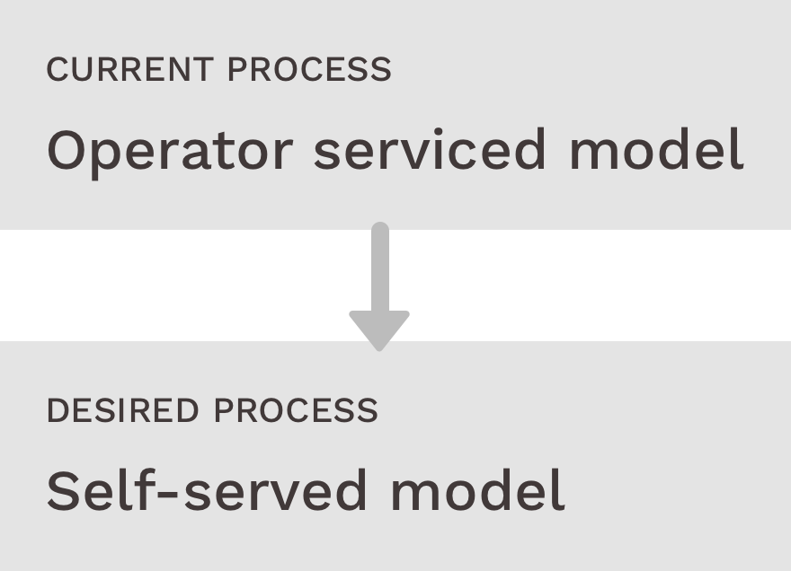
Redesign the existing multi-channel campaign management web platform to a manager-first business-driven application for IMIcampaign. Starting with a "HMW": how might we improve the Campaign Creation and Campaign Management experience for the Marketing Managers? The Problem: I am a Marketing Manager and I know what the campaign business requirements are. There is an operations team to translate the business requirements into a campaign. Due to the disjoint modus operandi there is multiple back and forth and a lot is lost in transition. Using the system is confusing and time consuming for me.
Contextual Enquiry
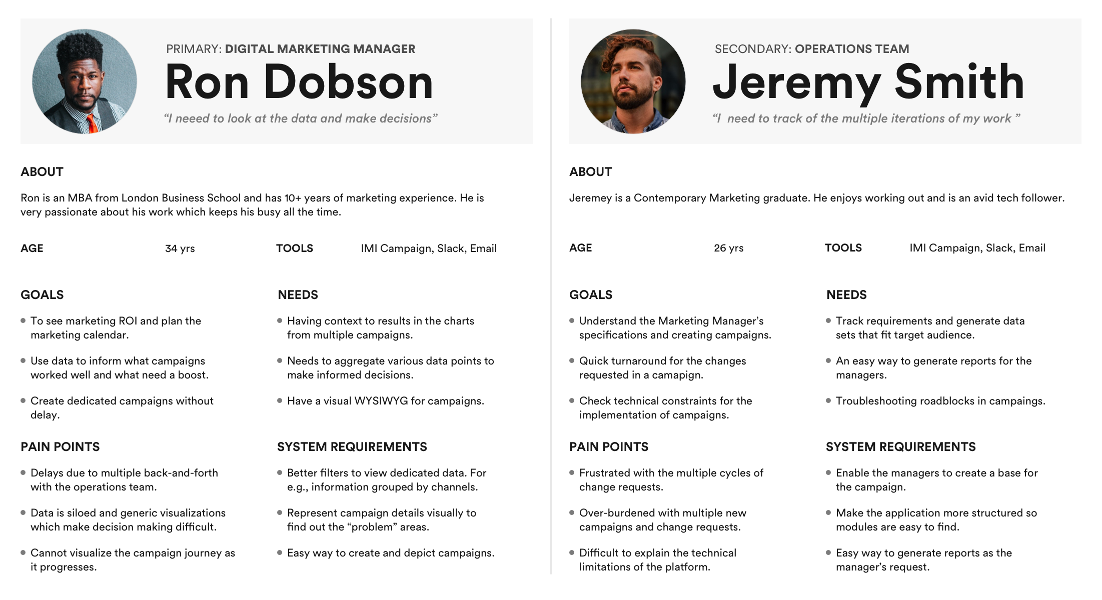
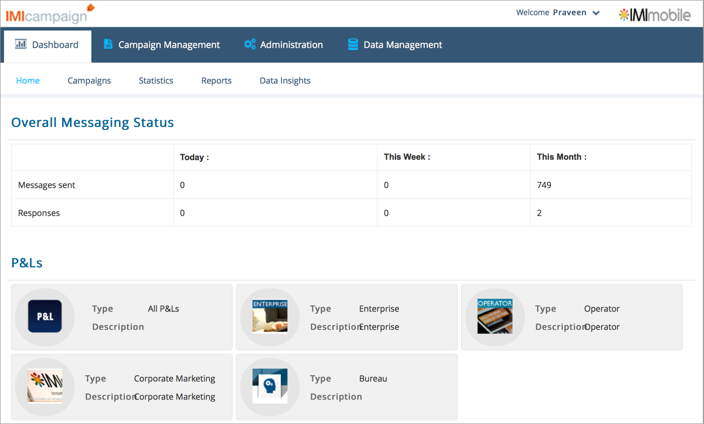
We interviewed 8 users: 2 Campaign Managers, 4 Operations Staff, 2 Developers. Insights from Contextual Enquiry and Heuristic Evaluation — Operational Challenges (see below), and User Experience Challenges: Generic Dashboard, Poor Data Visualizations, Tedious and confusing campaign flow, Hidden Menus, Inconsistent UI, Dated UI.
User Personas
Needs and Goals: since we are moving from an operator-served model to a self-served model the interaction between the Marketing Managers and the Operations team is reduced. Primary User Needs — Dashboard: make data-driven decisions; campaign statistics, user engagements & ROI; top to down statistics at a granular level; see information grouped by channels concerning a given date range. Campaign Management: represent and edit campaign details in terms of Who, What, When, and Where visually; unify campaigns at the level of the users' organization and teams around a single campaign calendar; provide a personalized experience to the customers. Goal KPIs: reduce Campaign Deployment turn around time by 30%; get actionable insights to pin-point problem areas; visualize the journey of a campaign.
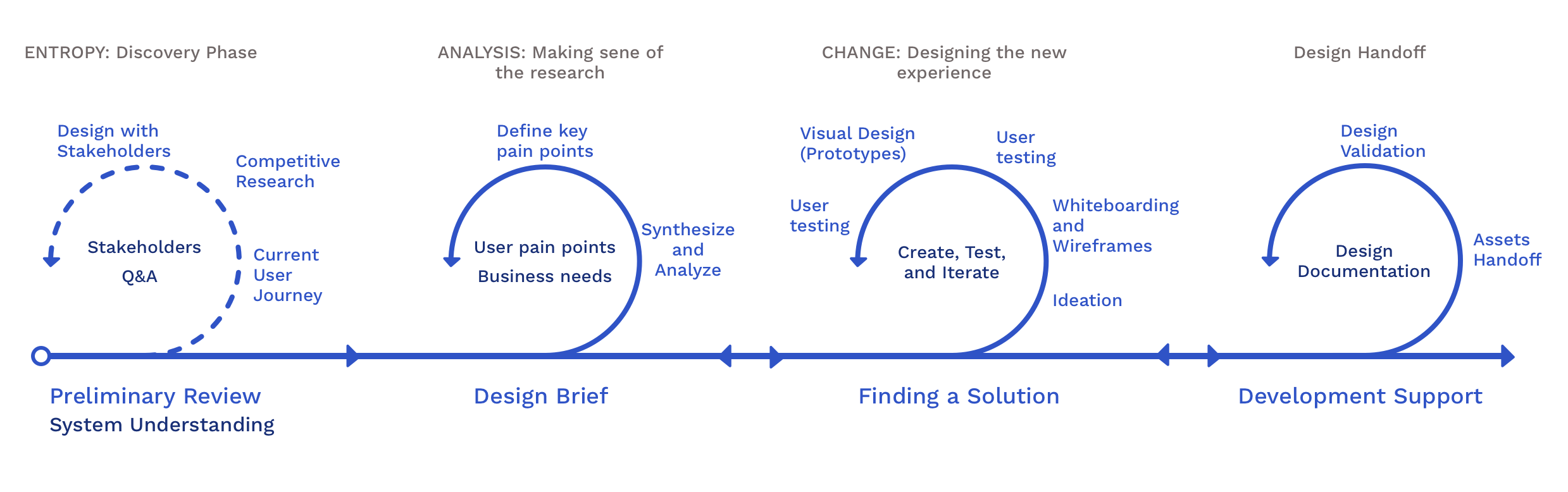
Ideation and Wireframe Iterations
Existing IA: understood the current system and created the existing IA — experienced the product first hand and worked out certain scenarios and use cases of relevance to the end users and the stakeholders. High-Level IA: created a high-level IA by performing a card sorting exercise as part of the primary research; understood the mental model of the stakeholders and the end-user. Detailed IA: iterated on the high-level IA to detail out the final version of the IA and eventually the entire application structure — this drove the page level detailing.
Process
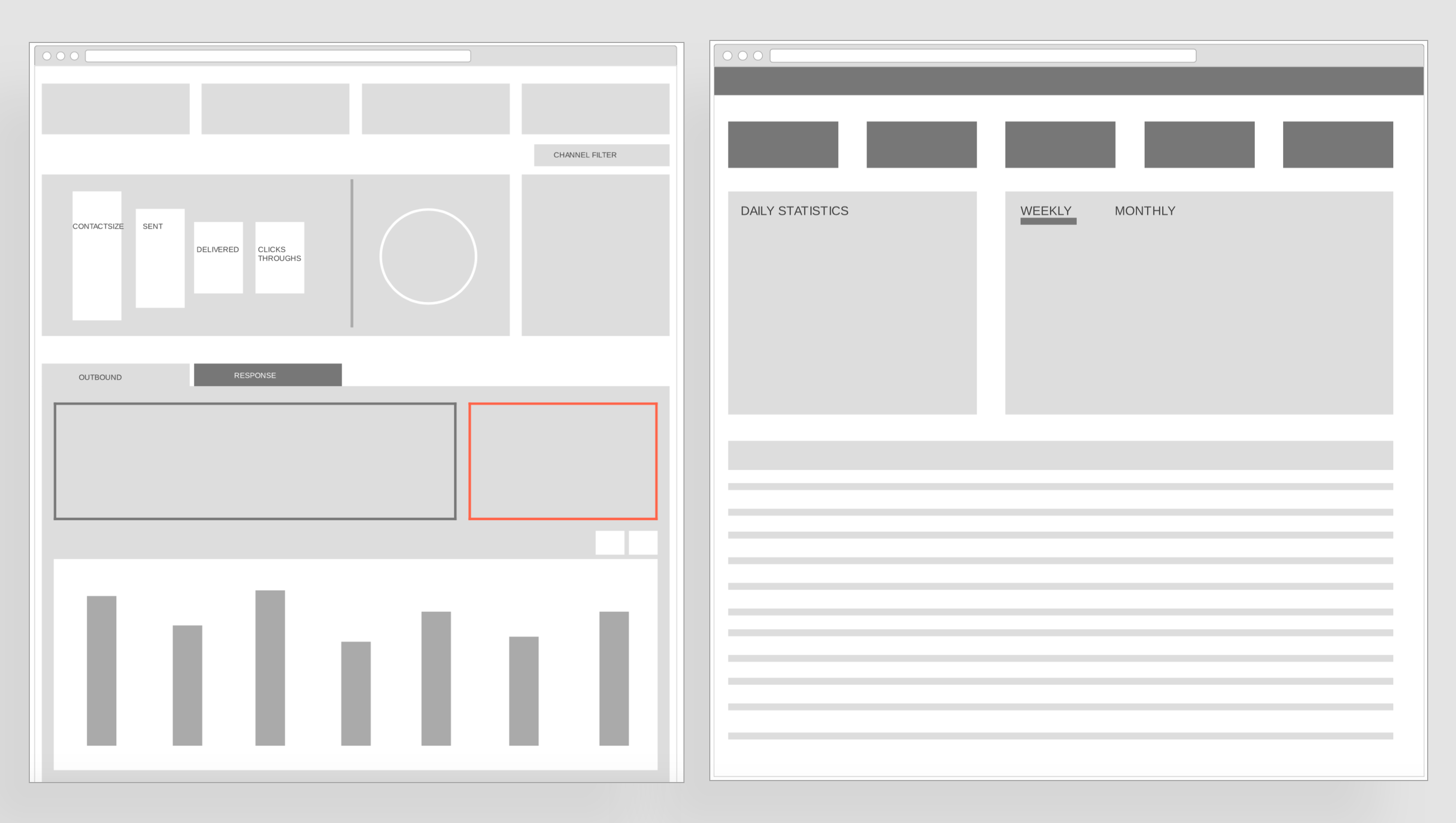
01 — Dashboard Design
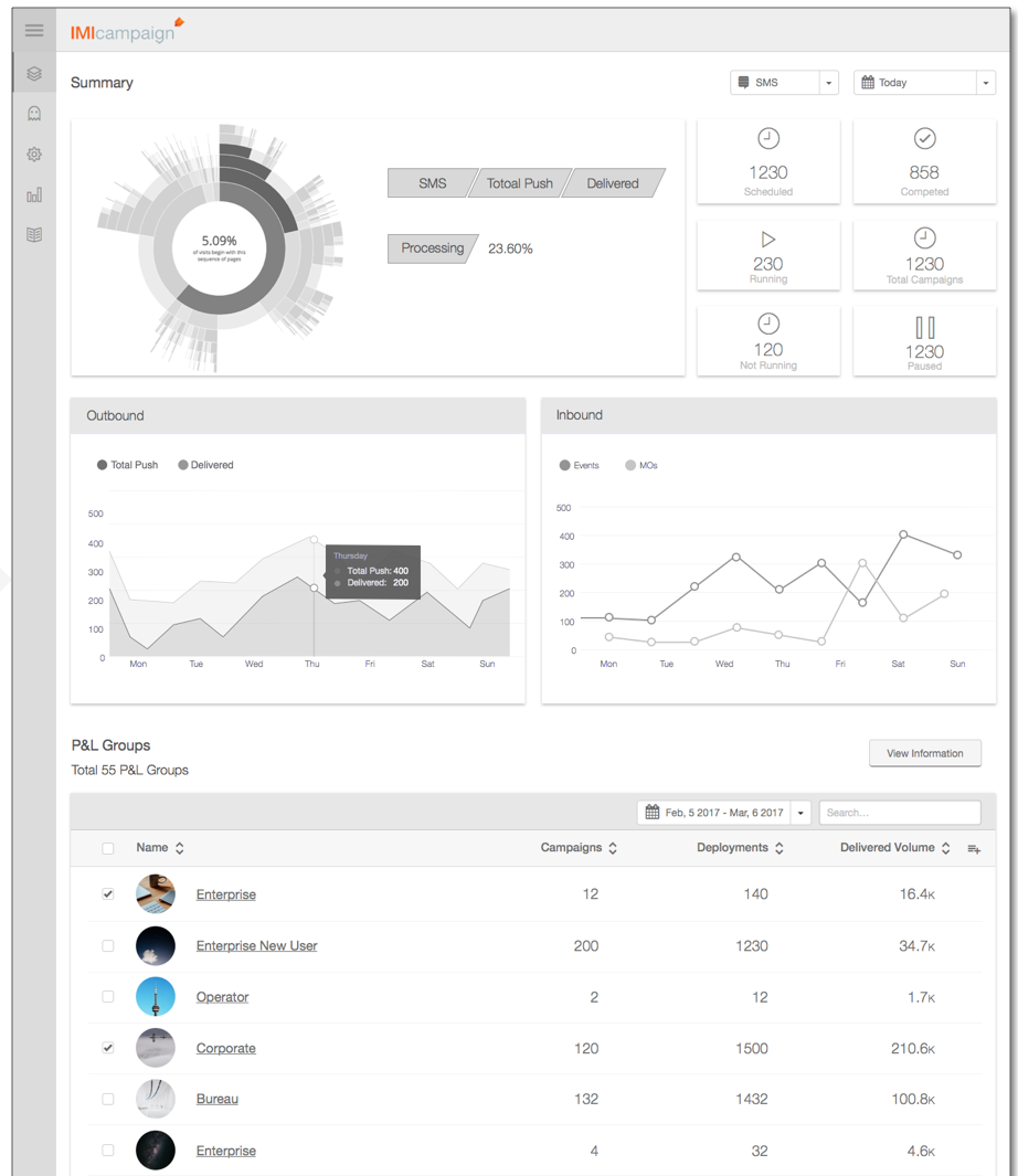
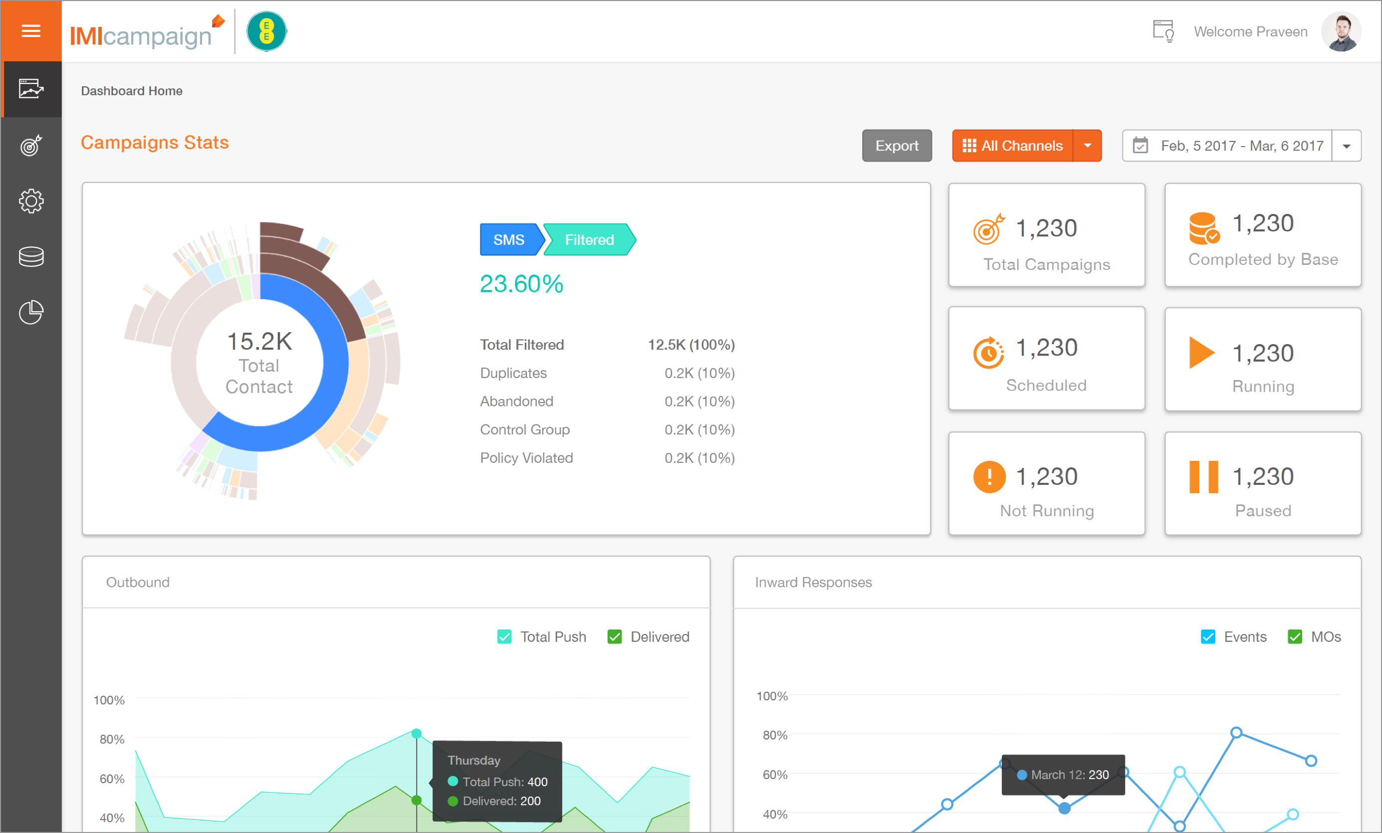
Since there was no clear understanding of the performance matrices of campaign(s) we decided to show the information as a dashboard on the landing page. We started to a very high-level block based wireframe which slowly got refined as had multiple discussions with the stakeholders. Rationale: this low level block diagram helped the stakeholders design with us, with their input being essential in every step of the way. Result: improved stakeholder buy-in — from comparing dashboard templates online to understanding how data models each visualization.
02 — Data Visualization Explorations
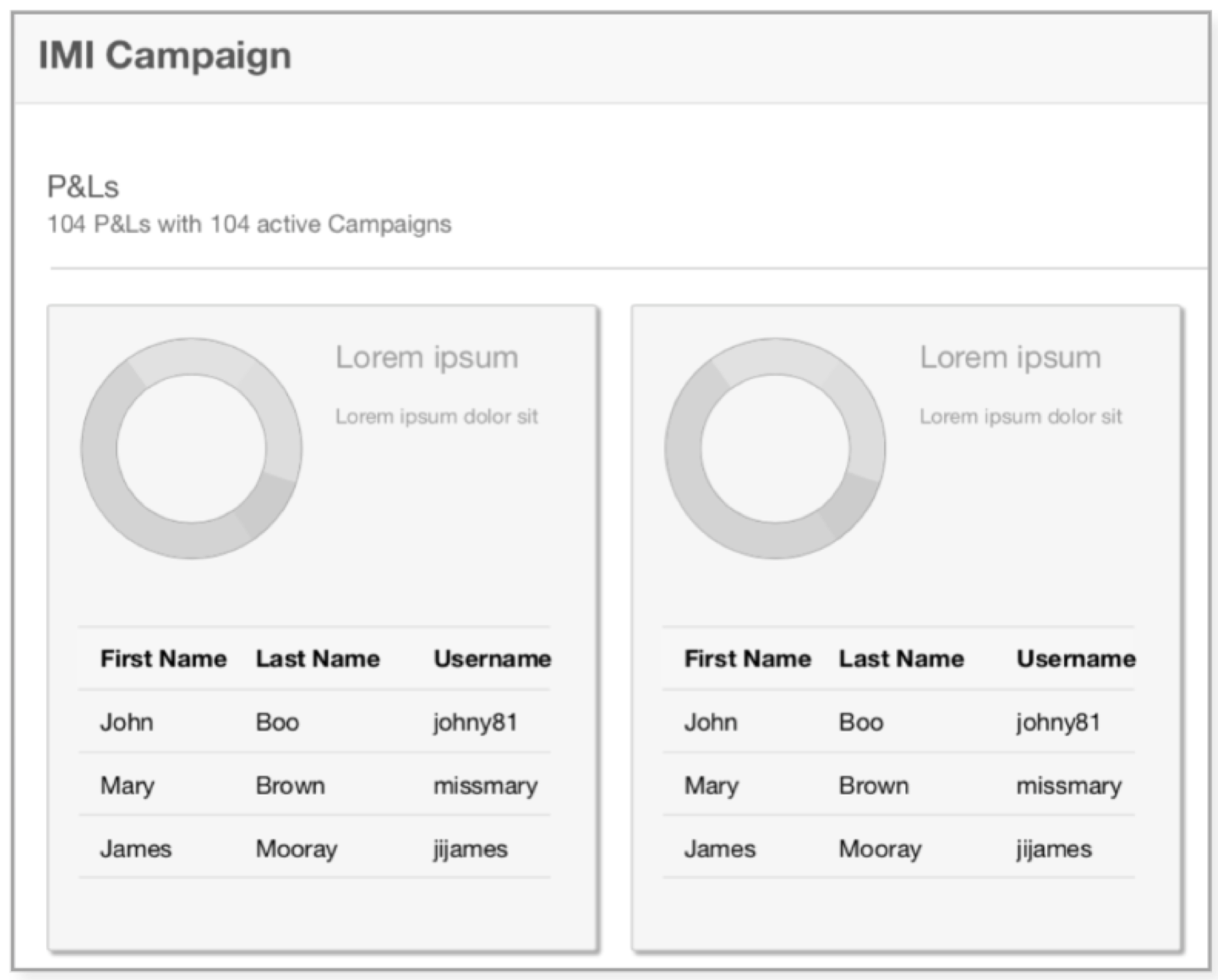
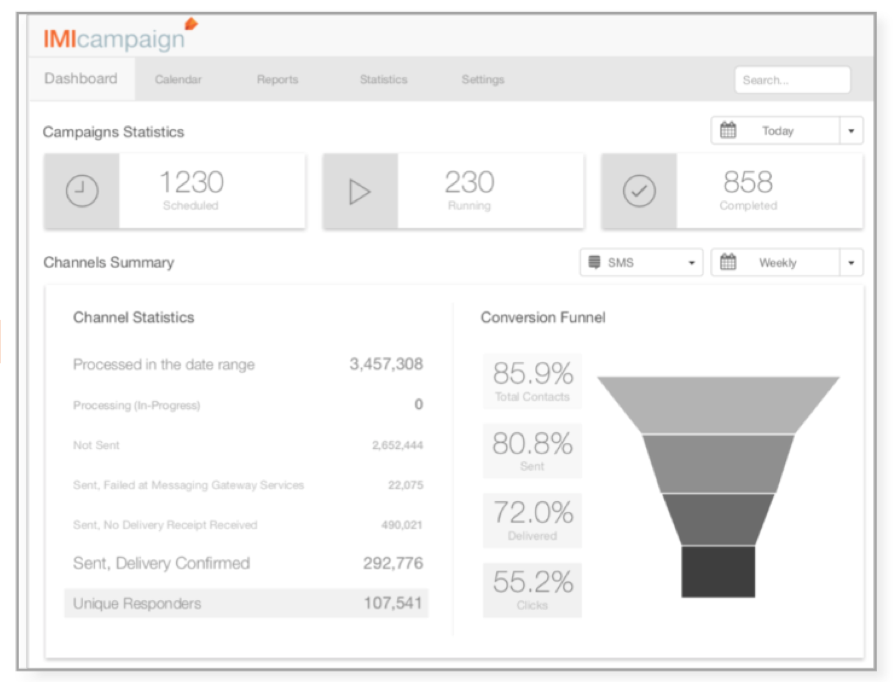
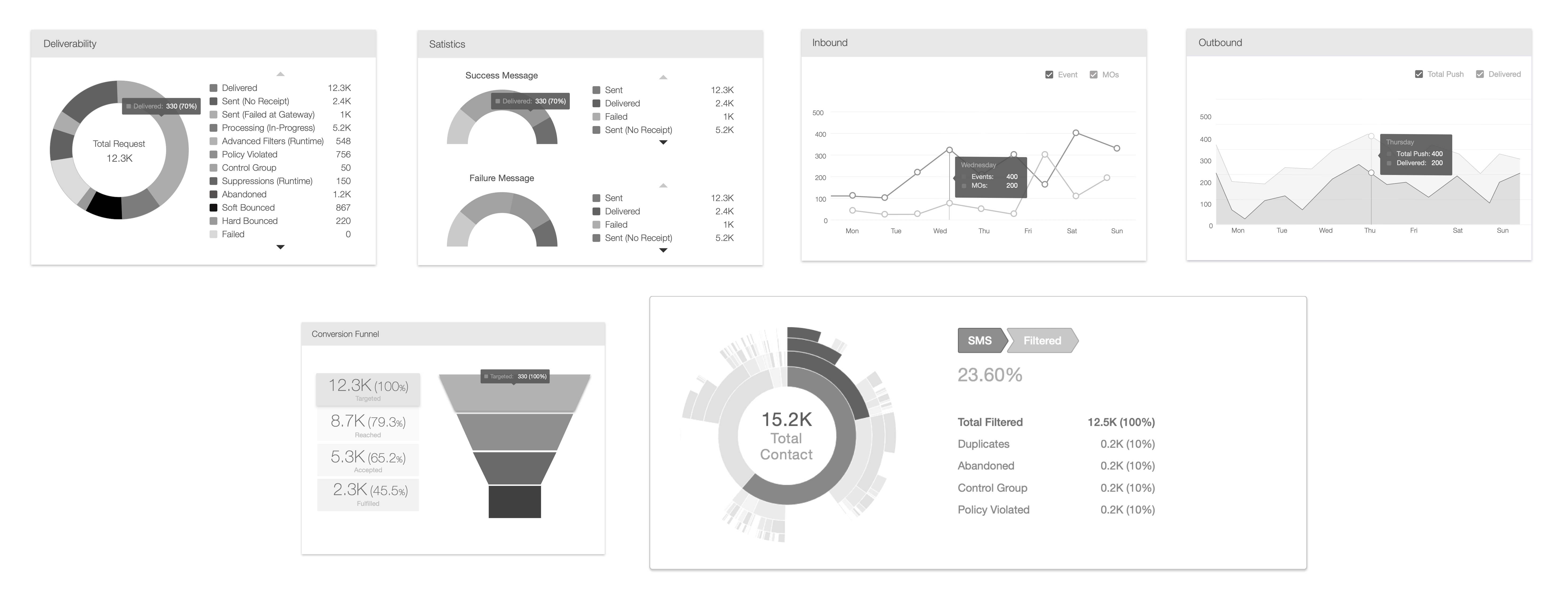
Option 1 — Card for each P&L: each Profit & Loss group had a performance chart with the tabular data present below its respective donut chart. Rationale: gives a high level view of the group both visually and textually. Feedback: there is no way to see more than more P&L group together or see the conversion. Option 2 — Conversion Funnel: to illustrate conversion the next chart explored was a conversion funnel. Rationale: gives channel level breakdown of the data and managers can look at "Sent" vs "Clicks" easily. Feedback: a conversion funnel is being used to track other processes on another platform — the goal here was to have a chart that is responsive and informative for the users. Final — Sunburst Chart: to utilize space more efficiently compared to linear hierarchical visualizations, the radial orientation of the sunburst chart works best and it is interactive. Rationale: all elements on the same level are regarded equally important, thereby eliminating the dichotomy between the elements on the periphery and center; since it resembles a pie chart, which most of us are familiar with, the Sunburst chart is intuitive in nature. Feedback: the users and stakeholders loved using a PoC version which had emulated data — we could hear them talk about the decisions they could make out of this.
04 — Listing Page Adaptations
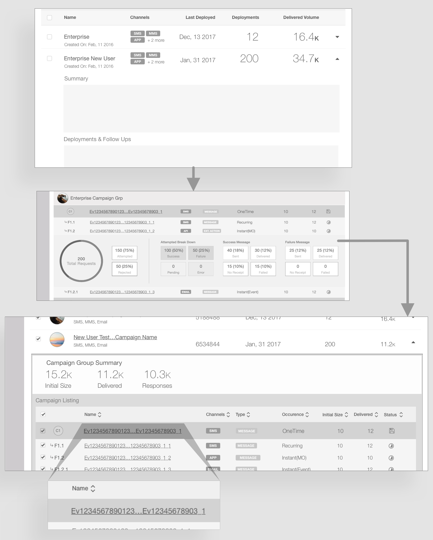
Since the platform was extremely data heavy, we had to make a few adaptations to cater to the need. Campaign Group & Deployments: each Campaign Group has deployments in terms of follow-ups and new campaigns — the listing has two parts, Campaign Groups with the contact size and responses, and an inner table with deployment level details such as name, channel, status, etc. (P&L → Campaigns → Deployments). Deployment Name: the deployment names could go up from 64 characters to 128 characters — to get around the problem, I came up with the idea of putting ellipses in between the name. Example: fifteen_charac...teen_characters.
05 — Calendar View Improvements
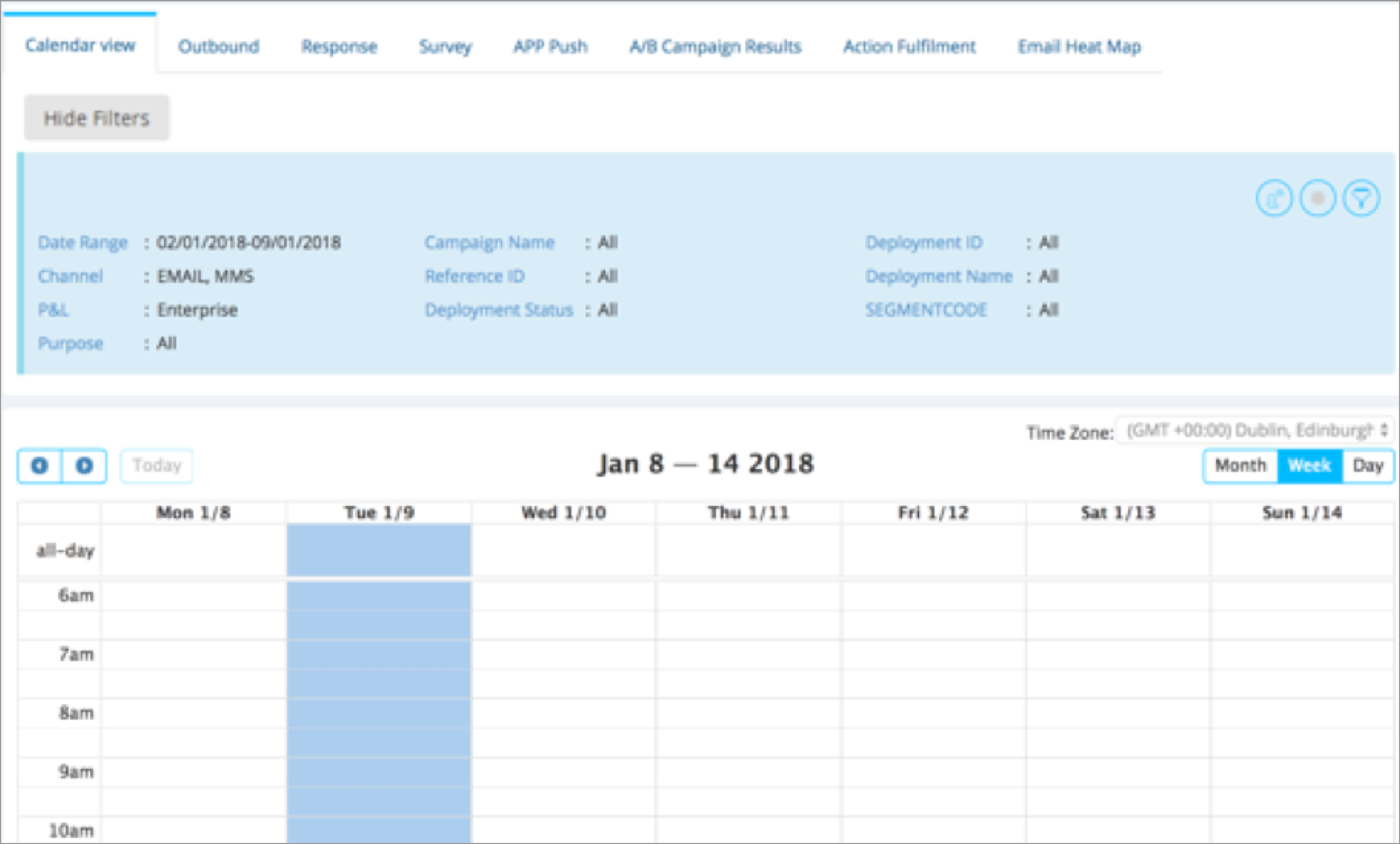
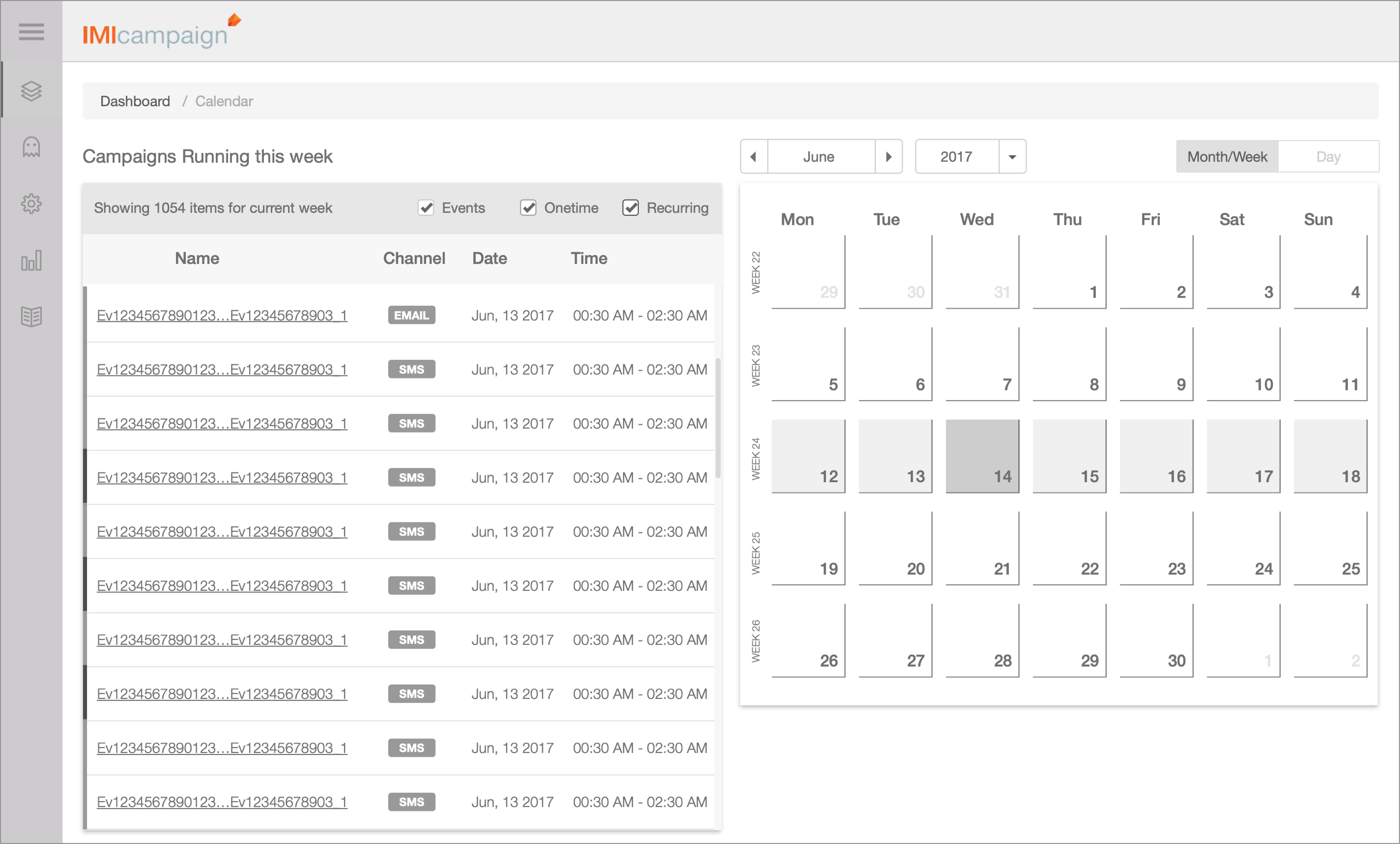
Managing Information Overload: imagine having to manage more than 100 meetings on your daily calendar! Failed iterations: having only a calendar view; having only a list view with dates as filters. Solution: finally, we decided to create a calendar view along with a list view so that users can look at the calendar and yet see the campaigns running in the time selected.
06 — Campaign Creation Canvas
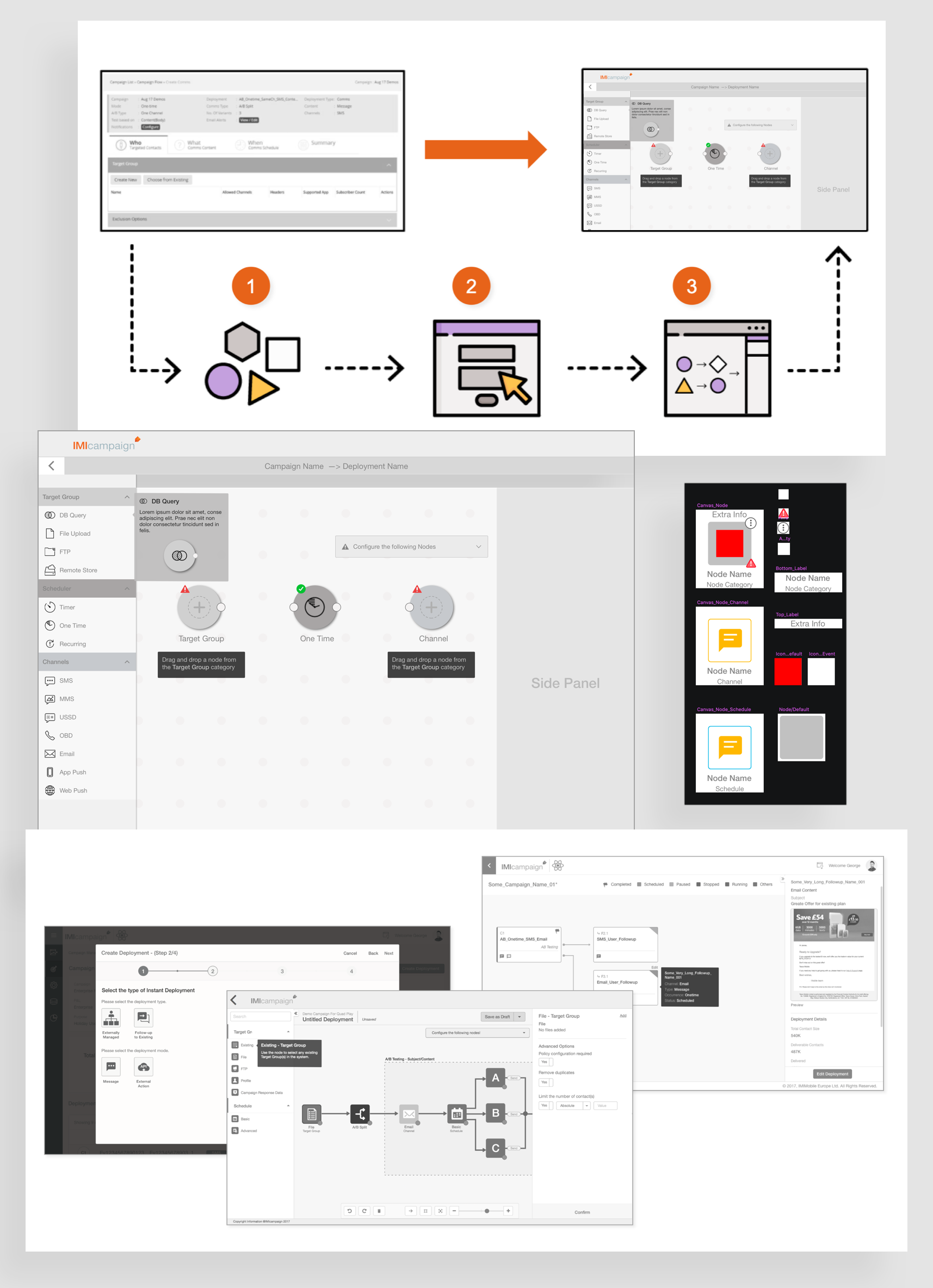
Forms → Canvas. Nodes: understood the atomicity of the form and broke the form down into free individual units called Nodes. Defining Properties: designed properties of the nodes based on what associated values can be captured and configured. Canvas: integrated all the nodes on the canvas by identifying the dependencies and how each is related to another in a specific flow. Canvas Nodes: leveraging Sketch's "Symbol" and "Library" functionality to speed up the workflow and maintain consistency — as this was a new concept compared to the current system, we decided it would be best to ideate with mid-fidelity wireframes in order to gather better feedback.
Final Designs
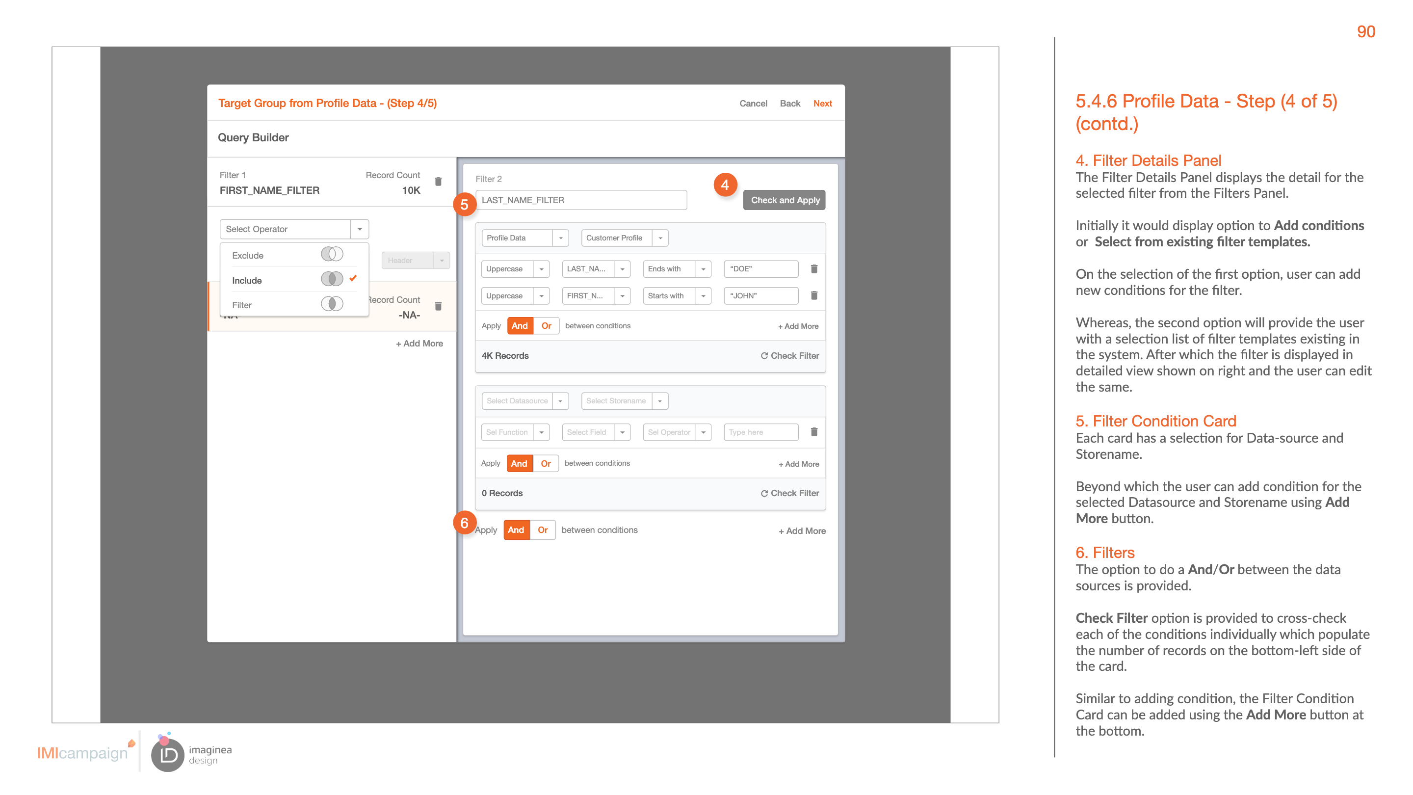
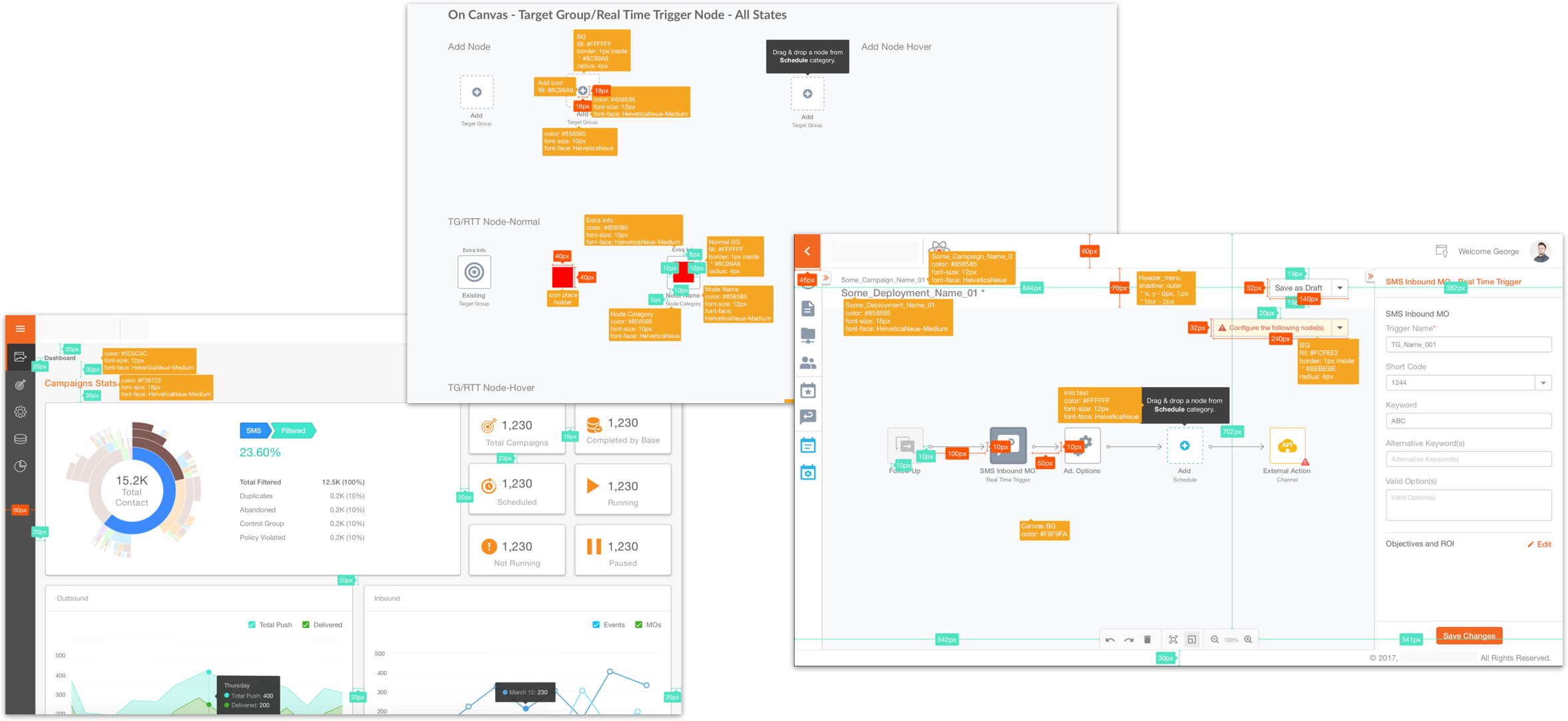
Wireframe Specification document: a design is as good as its documentation. Keeping this in mind we created an elaborate Wireframe Specification document which detailed out the various components, graphs, charts and the screen level interaction elements which were used, along with details about the ideal data and outcomes for data tables and charts — this was the one document used by the UI development team to understand and adhere to the interaction guidelines for the product.
Dashboard: Monitoring Campaigns
This section of the tool describes how a manager would login to the tool and make informed decisions using the real-time graphs and tabular data to drill down to the most granular detail about a campaign.
Visual Campaign Builder: Provisioning Campaign
This section of the tool shows how a manager would go about and create a campaign using the visual builder tool.
Wireframe Specification & Visual Guidelines
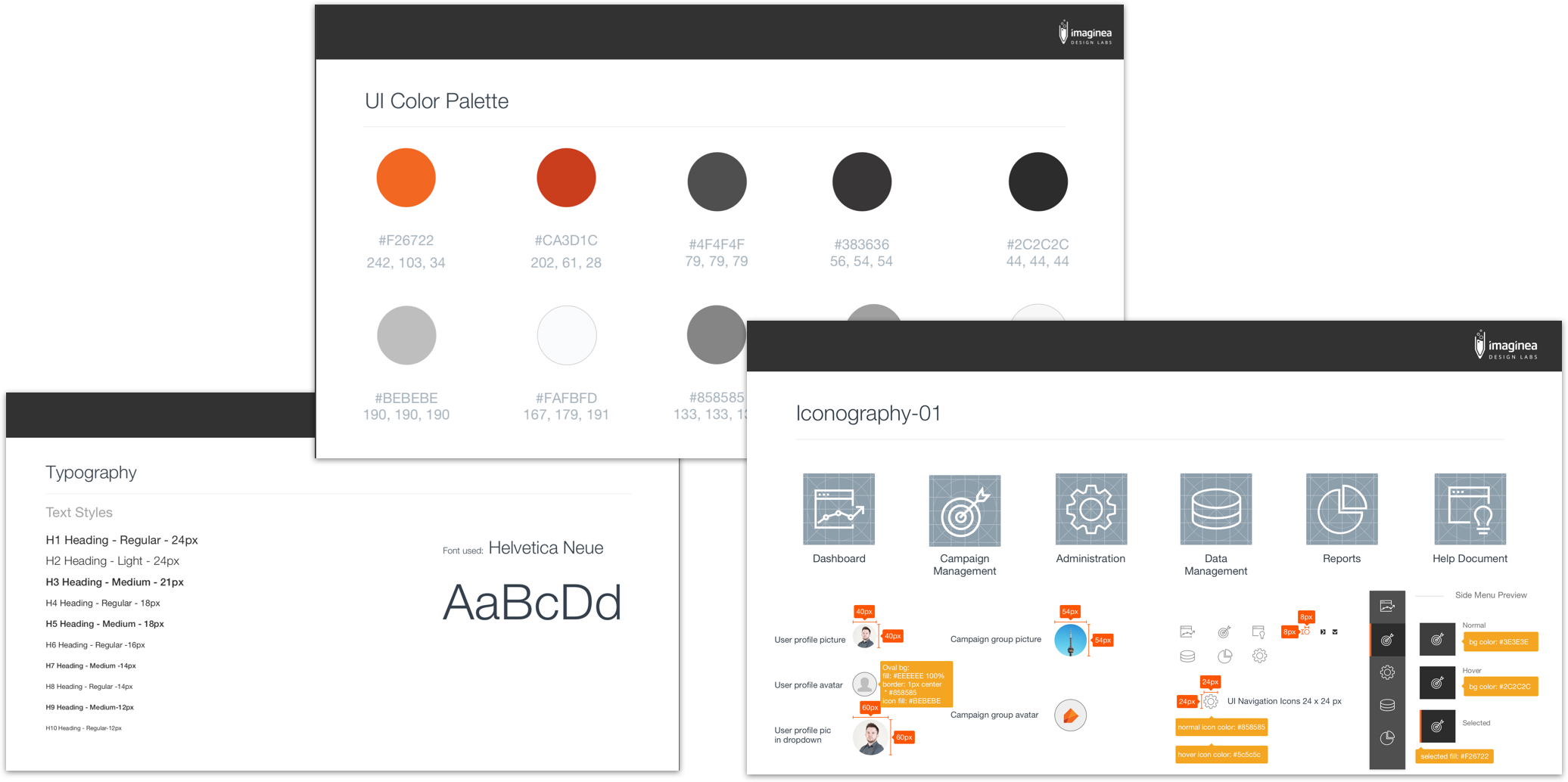
The Wireframe Specification document and a visual style guide were handed off to the UI development team to keep implementation consistent with the interaction guidelines.
Usability Testing, Business Impact & Key Takeaways
Usability Tests
Key questions: Adoption (what do users think about the shift in the IA along with updates in the dashboard and campaign creation processes?) and Impact (are users able to imbibe information faster and create campaigns quicker? How is the learnability of the new system?). We conducted remote usability tests with 10 users who used to drive, provision and execute campaigns on a daily basis. The overall reaction of the users was positive and they could appreciate the sense of structure and clarity that was brought by the design — the refreshing modern UI was very pleasing to the users.
Positive Impact
This design overhaul has positively impacted the business and entirely transformed the product to compete with other competitors like Adobe Campaign Manager and Salesforce.
Learning Curve
The learning curve is relatively flat, which was proven by the usability tests.
Designing with real data
As there were multiple changing factors it was eye-opening to design with real data and see its positive impact.
Iterating High-Fidelity Wireframes
As the product leaders and clients were constantly reviewing designs we had to stick to wireframes of higher and usual fidelity.
Co-designing
Involving the product team with weekly whiteboarding sessions helped us design better solutions.
Evidence and attribution
Owner-published case study. Public copy is verbatim from the owner's original case-study page (content/migrations/legacy-portfolio/cache/imi/scrape-raw.json); underlying research artifacts remain pending. Teammate names and the engagement dates are owner-confirmed (2026-08-15).
Evidence IDs: evidence_imicampaign_contextual_enquiry, evidence_imicampaign_usability_test, evidence_imicampaign_navigation_time, evidence_imicampaign_creation_time, evidence_imicampaign_handoff_time, evidence_imicampaign_spec_document
I'd love to connect with you.
For the underlying artifacts, contribution detail, or a walkthrough of the work, get in touch.
Start a conversation